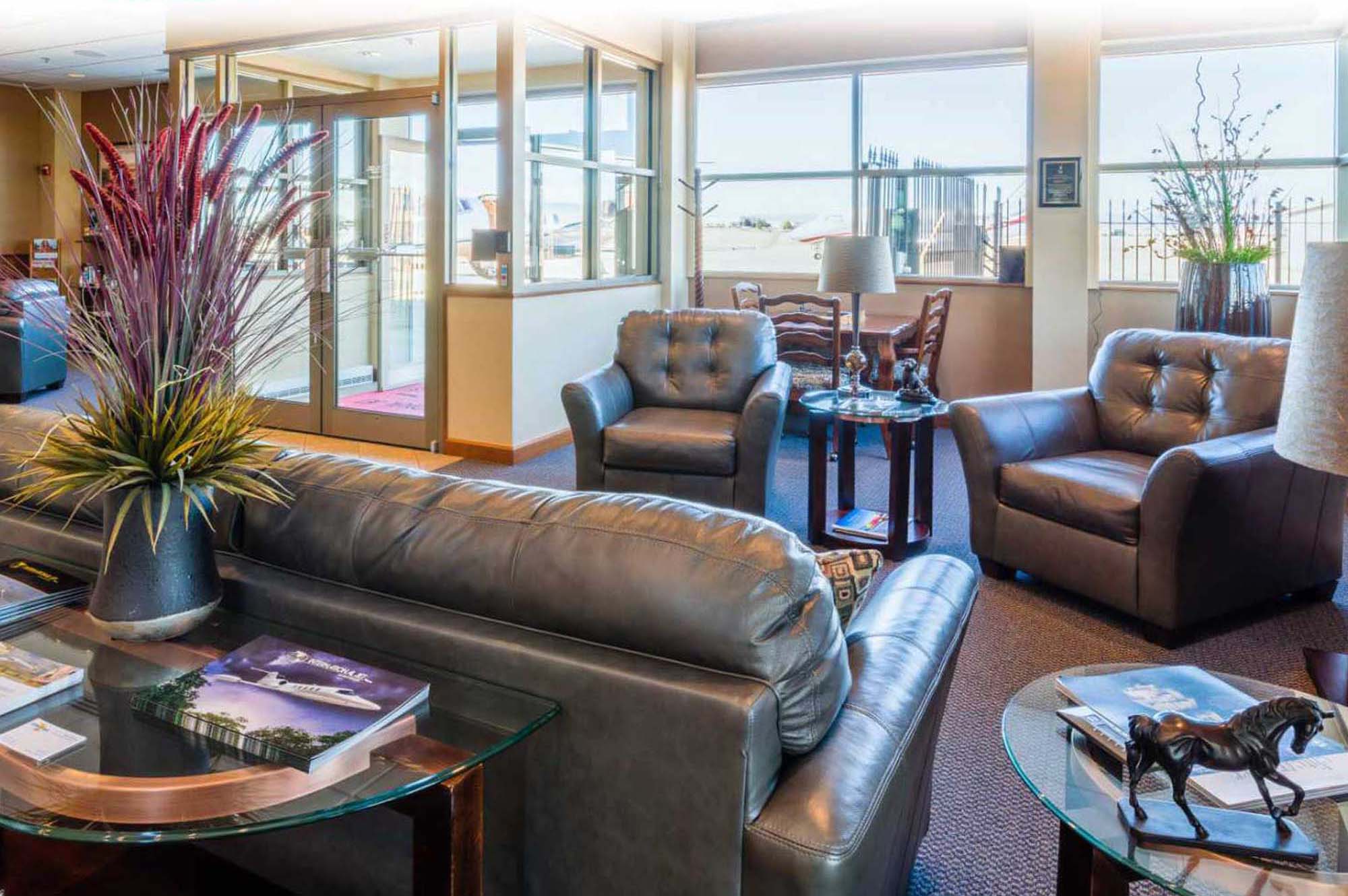
- ROCKY AVIATION
- iTHRIVE YOGA (closed for good during COVID-19)
8 Seconds
A lot of clients when beginning a new web design project want to stick as many things as possible "above the fold," that magical measuring line from the days of printed newspapers. They want action at the top of the page, moving parts and popups to capture email addresses. They want what they perceive to be sizzle to come first because many feel that users don’t like to scroll down the page. Moving images, background movies and popup messages all have their place, but is it on the home page of your website? The first thing visitors see? Probably not for most businesses. Let me examine a few of them and then look at a better solution.
First, we need to consider that new visitors to a website give it eight-seconds, on average, to communicate effectively who they are and what they do. Eight-seconds to convince visitors something of value lies within. Think about that. Eight-seconds is not a lot of time. And that includes the page load time. (Page Load Time is how long it takes to load your page, the images and text, once the visitor lands on it.) Image sliders and email sign-up popups distract from the user experience at the most crucial time for visitors coming to a website. Can your site communicate effectively who you are and what you do in eight-seconds with images switching out and popups asking visitors to join a mailing list? Not likely.
POPUPS, SLIDERS AND ABOVE THE FOLD WISDOM
Email sign-up popups have become ubiquitous. The vast majority of users find them annoying, at best. Popups don’t kill the bounce rate of the page. Most people get annoyed and click off it. It does, however, kill the user experience. It is the same as a store clerk mumbling something inaudible and walking away when a new customer walks in the door. It’s not inviting and can change the mood of any new visitor.
Does the "Above the Fold" wisdom still exist? Most likely no, it doesn’t. Any website is going to be accessed by multiple devices with widely varied screen sizes. Defining the "fold" is difficult, at best. The real key is to get users to take action. Studies have shown users are more likely to take action after they read an article or digest information rather than before, and those clicks are people who are sincerely engaged in what you have to offer them. It’s about motivation. Keep the page simple, rely on quality content. If you put that call to action at the top of the page most visitors lack a frame of reference to want to engage you. (One study you can read)
Rotating sliders and carousel images (including stories that rotate) are great for news sites that are constantly changing and updating. It’s more expected and natural because of the nature of the business. But for the rest of the web, the non-CNN sites, studies have shown fewer than two percent of visitors click on slider or carousel images. Of those, 90 percent clicked on the first image. (This is fun) The odds are, your carousel images are wasted time and real estate on your home page.
There are some other exceptions to this rule. Ecommerce sites with lots of products and specials, especially if they’re well-known entities, can get away with them. But those few exceptions are where they really work. Otherwise, they become usability nightmares and wasted time when loading the page.
WHAT WORKS?
If you only have eight-seconds to communicate to visitors who you are and what you do don’t waste them loading images and javascript that won’t be used or that will annoy visitors. I’ve found two very effective techniques to engage visitors and get them to stay on your website.
First, keep things simple. From an SEO perspective, Google wants to see 4 - 6 main links in your header. Customers do, too. If you have just a few seconds to engage them be economical with how you display your site’s hierarchy. When thinking about those primary links I always ask clients one question: What makes you money? Those areas should occupy primary real estate and deserve to be in your main menu. A sub-menu can contain ancillary information and sections of the website that aren’t as critical to the business. But your header needs to be focused. Don’t clutter it with things that confuse visitors or get in the way.
Second, we are visual creatures. We like stories with pictures and words. A large main photo that establishes the tone, style or image of your business can communicate as much as your content. Inside that main image—as text on the page (think SEO)—focus on your primary message and how you can benefit new customers.
Background videos can be extremely effective at communicating mood and style, but they have to be done well. They need to be short—very short, 6 to 15 seconds. They are visual enhancements without sound. They don’t work for every business, but for some they can have a big impact, especially for luxury brands. That said, they shouldn’t be shown on mobile devices at this time. They take up too much bandwidth and can slow the page load.
EXAMPLES
Below are two examples of websites where this approach has been extremely effective. (For more look at my work.) Both have bounce rates in the 40 percent range (sometimes even lower) for the entire site. iThrive Yoga’s home page has a bounce rate of 15 percent! And Rocky Aviation’s is in the 24 percent range. Both sites dominate their local markets. iThrive Yoga gets over 7,000 page views a month and 60 percent of the visits are new people. That’s a local yoga studio in Parker, Colorado (pop. 50,000). The site is older now, but still effective. Rocky Aviation's site, like iThrive's, communicates clearly who they are and what they do the moment you land on it.
Rocky Aviation also demonstrates when and how to use popups. They collect leads for insurance and aircraft listings through the site. The popups are nothing intrusive, something the user requests.
Ultimately, an effective website will persuade new visitors to stay and look further because it communicates simply and clearly to them. It turns eight-seconds into a much longer relationship.


 Jack McDaniel has been a great resource to CognitiveScale. He has helped build out a new website, write content, and develop a management dashboard to help us track Marketing KPIs. He quickly understood our business and contributed to writing and editing content, which has always been a challenge for us given the complexity of our technology. Jack was able to dive right in and contribute to our new messaging, and then translate this to SEO, advertising, and a number of Marketing campaigns. And his work drove results that were very valuable."
